SARNO Brand Identity
Project
Overview
Sarno is a premium pizza brand that prides itself on crafting artisanal pizzas with authentic Italian flavors. When Sarno approached me, they sought a brand identity that would capture the essence of their craftsmanship and the rich cultural heritage of Italy. My goal was to create a visual identity that reflects the quality, tradition, and passion behind every pizza they make.
Company : Thalias Hospitality
Year : 2023
Type : Brand Identity - illustration - Packaging Design
Brand Identity Development
Logo Design
The Sarno logo is a blend of tradition and modernity. The elegant typography combined with the intricate icon symbolizes the artisanal nature of the brand. The logo design is inspired by classic Italian aesthetics, bringing a touch of sophistication and authenticity.
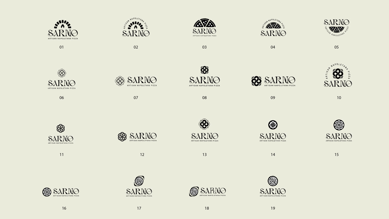
To ensure the logo perfectly captured Sarno's essence, I developed a series of initial concepts. Below are the options that were presented to the Sarno team for review:
Each option explored different elements, including traditional Italian motifs, artisanal symbols, and modern design aesthetics. After receiving valuable feedback from the Sarno team, we refined the selected logo to perfectly align with their vision and brand identity.


Color Palette
The color palette for Sarno is inspired by the rich textures of pizza and the vibrant colors of the Italian flag. Featuring deep greens, bright reds, and creamy neutrals, these colors evoke a sense of tradition and premium quality. Here is the detailed color palette used for the Sarno brand identity:
Dark Green (#0E261C): Reflecting the lush Italian countryside and the rich quality of the brand.
Bright Green (#009246): Adding freshness and vibrancy, reminiscent of fresh ingredients.
Red (#CE2B37): Symbolizing passion and the rich tomato base of pizzas.
Cream (#EBEBDC): Providing a neutral balance, reminiscent of pizza dough and cheese.
Off-White (#FFF2D9): Adding warmth and a subtle touch of elegance.


Illustrations
To further enhance the brand identity, custom illustrations were created. These illustrations depict joyful pizza artisans at work, bringing a playful and human touch to the brand. The illustrations are designed in a minimalist yet expressive style, making them versatile for various branding materials.


Typography
The typography chosen for Sarno is both classic and readable. The primary typeface has a vintage feel, aligning with the brand’s traditional roots, while the secondary typeface is clean and modern, ensuring readability across all platforms.

Patterns
The pattern for Sarno is derived from the icon of the logo, creating a cohesive and recognizable design element that can be used across various brand materials. This pattern adds a unique and consistent visual texture, enhancing the overall brand identity.

Packaging
Design
Sarno’s packaging is designed to stand out on the shelves while reflecting the brand’s premium quality. The packaging features the brand colors, logo, and illustrations, creating a cohesive and visually appealing look. The design ensures that the product is instantly recognizable and communicates the artisanal quality of the pizzas.


Marketing Materials
Print
Materials
From business cards to flyers, the print materials for Sarno are designed to be elegant and professional. The use of rich colors, sophisticated typography, and custom illustrations creates a strong visual identity that is both memorable and impactful.


