Honey Label Design
Project
Overview
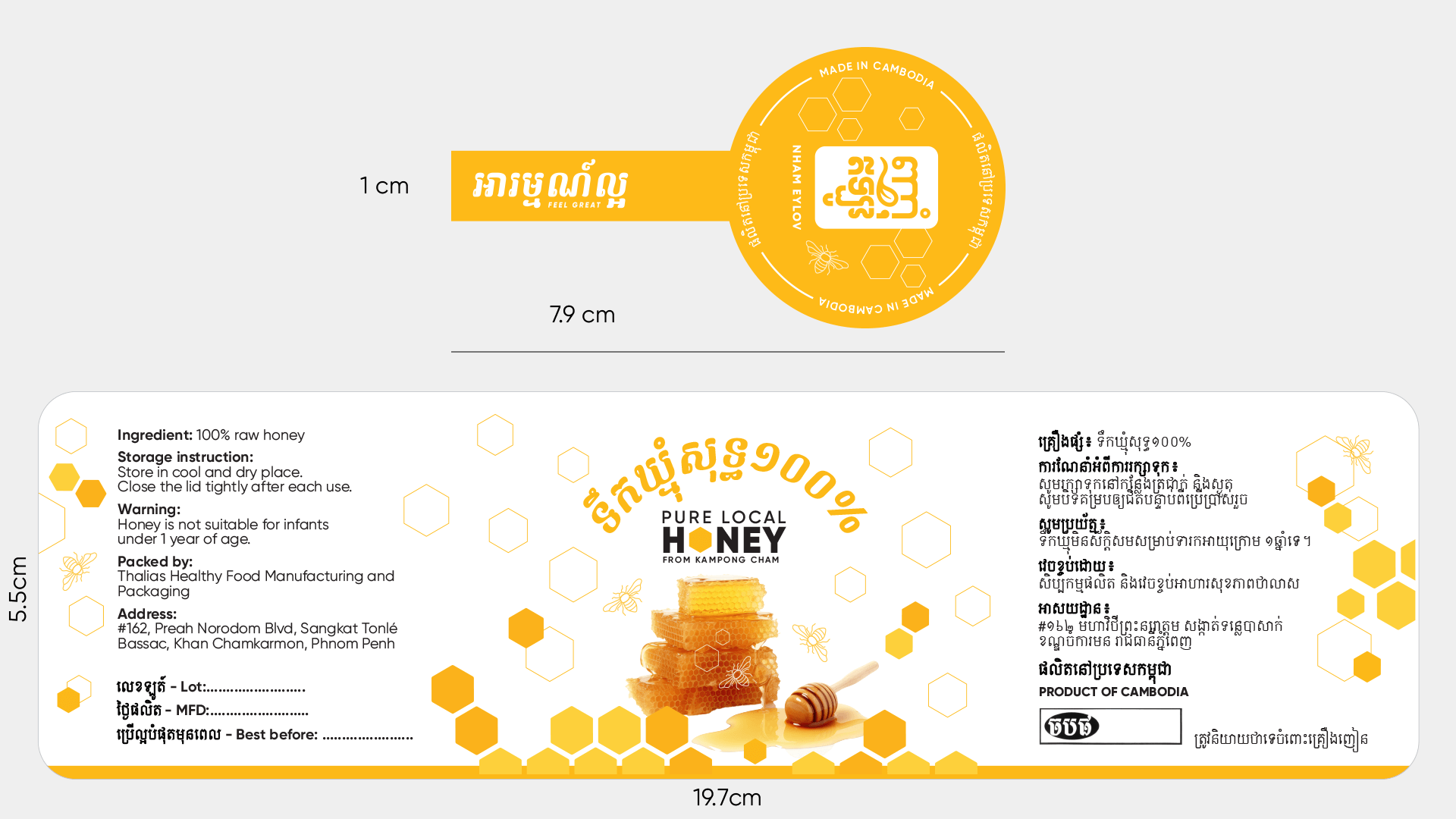
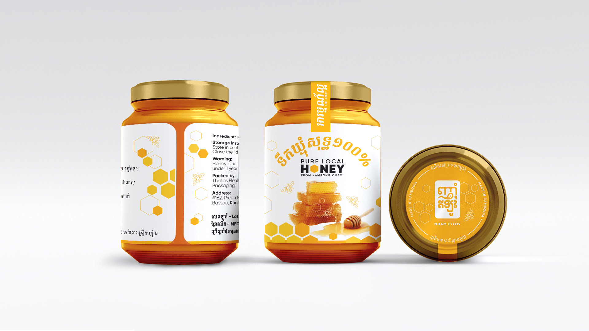
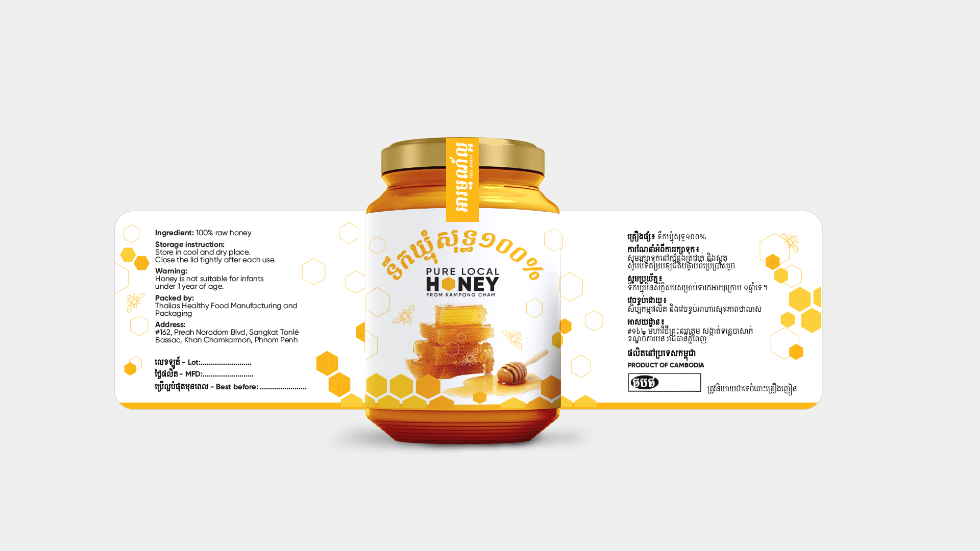
The Honey Label Design project involved creating two distinct label concepts for a premium honey product. This project highlights my skills in art direction, layout design, and the use of Adobe Illustrator to produce professional and engaging labels. Each design option reflects the brand’s identity and aims to attract consumers with its unique aesthetic appeal.
Design Process
Art Concept
The concept for the Honey Label was inspired by the natural purity and richness of honey. The design elements and color palette were chosen to evoke feelings of quality, nature, and indulgence. The goal was to create labels that not only look appealing on the shelves but also convey the premium nature of the product.
Layout & Design
Using Adobe Illustrator, I developed two label design options, each with its unique features and appeal.
Option 1
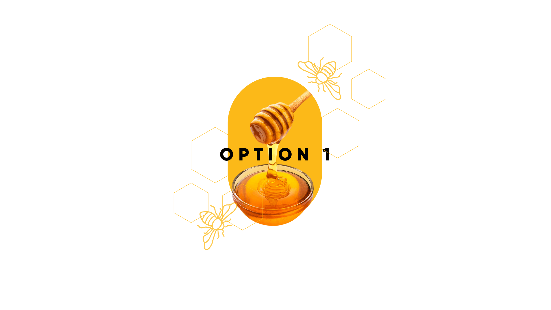
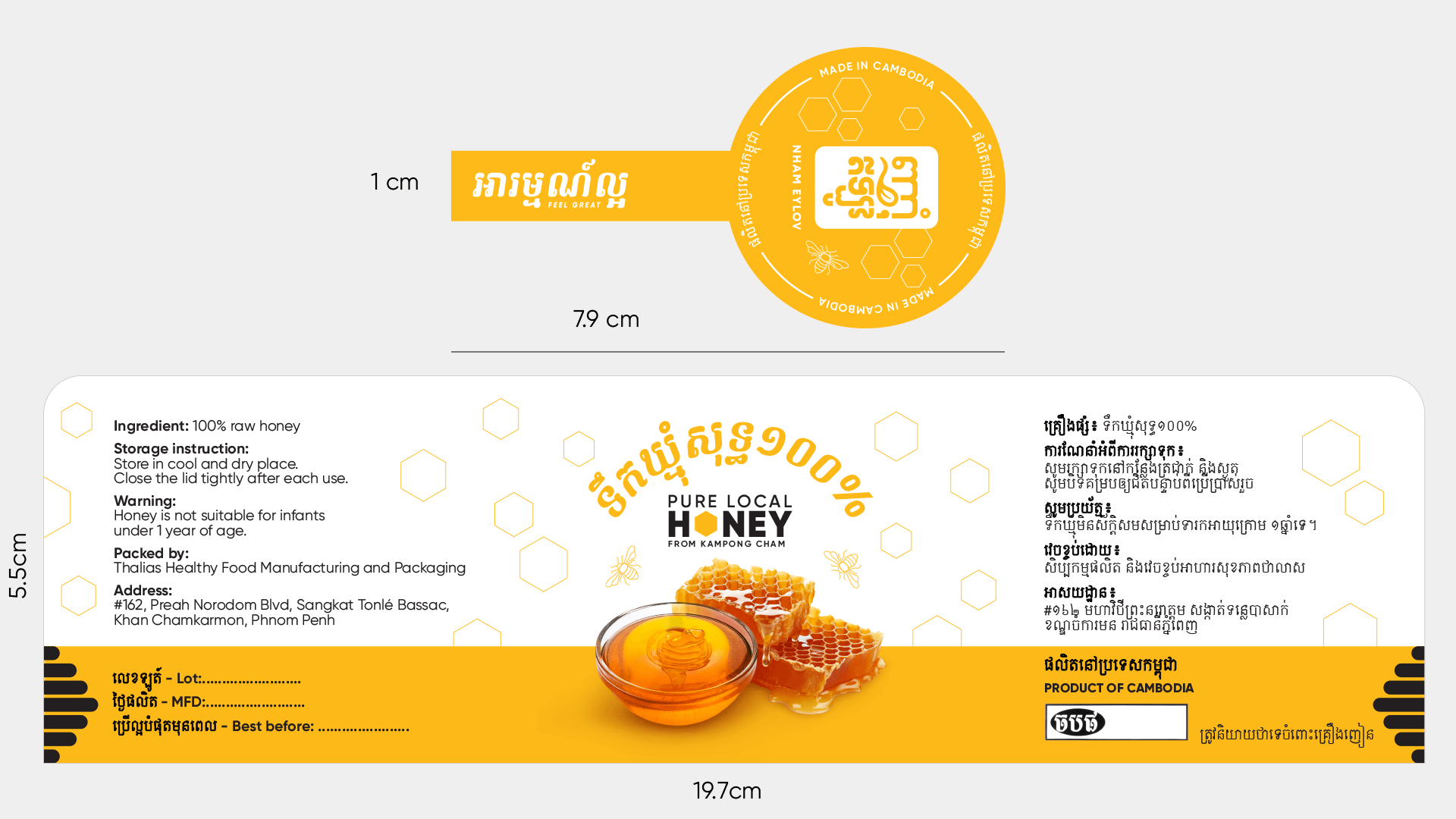
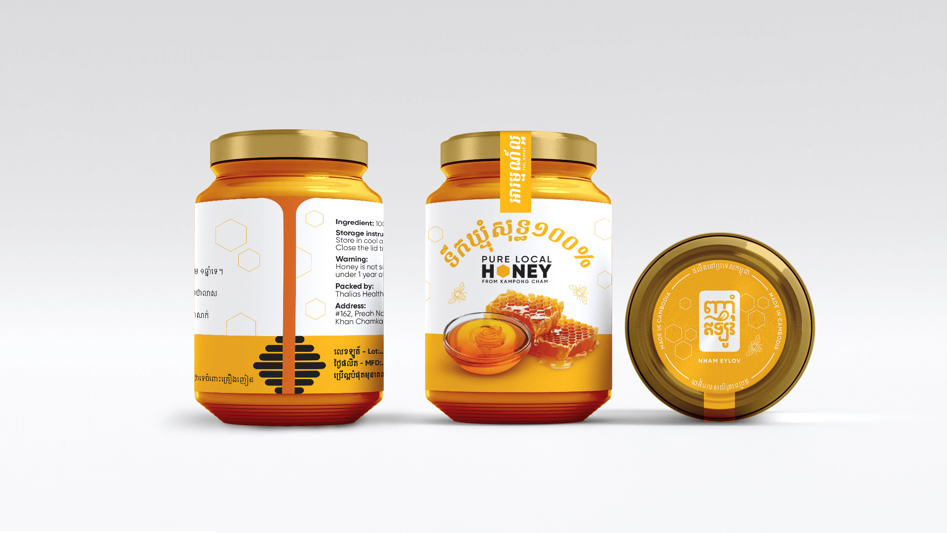
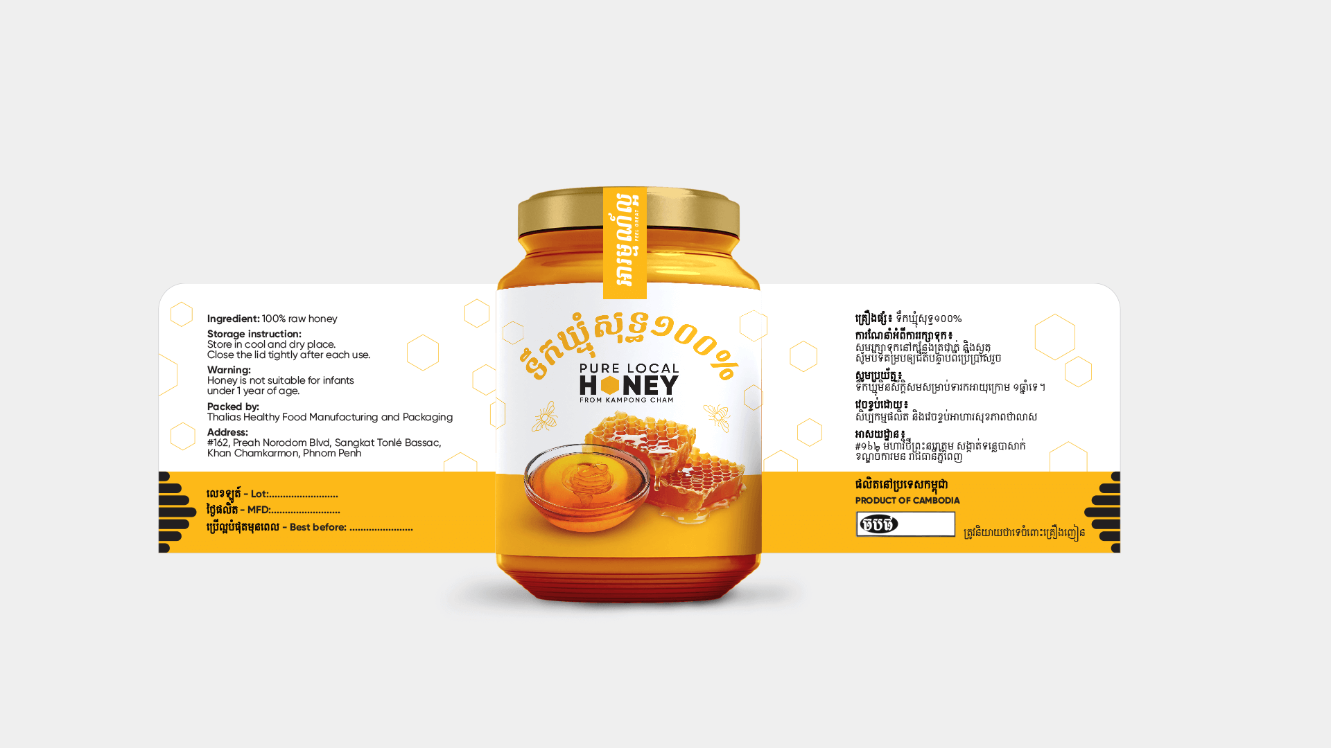
Option 1 features a clean and elegant design with a modern touch. The label includes a prominent honeycomb pattern, symbolizing the natural source of the product. The typography is bold yet sophisticated, ensuring readability and brand recognition.
Option 2
Option 2 offers a more traditional and rustic design. It features earthy tones and a textured background that gives a handmade feel. The typography is classic, complementing the overall aesthetic and emphasizing the authenticity of the honey.
Option 1
Option 2

Conclusion
The Honey Label Design project showcases my ability to create visually appealing and functional labels that enhance product presentation and brand identity. By using Adobe Illustrator, I was able to develop two distinct design options that cater to different aesthetic preferences while maintaining a cohesive brand image. This project reflects my commitment to quality and attention to detail in design.
